How to read your performance charts
Fitness, fatigue and form, mean-maximal curves, decoupling and durability. What each chart can tell you, and the question each one cannot answer.
Every chart on the Performance surface answers one narrow question well, and several neighbouring questions not at all. Reading them is mostly a matter of knowing which is which. So here is each one in turn: what it shows, how to read it, and the question it cannot answer.
Key takeaways
- Fitness and fatigue count load. They cannot see whether the load was the right load.
- Your power and pace curves say what you could hold when reasonably fresh. They say nothing about hour four.
- Decoupling needs comparable conditions. Heat, dehydration and under-fuelling move it without any change in fitness.
- Durability is the read a fresh-legs test is structurally incapable of producing.
- A threshold should be estimated from efforts you actually did, shown with those efforts attached, and open to your disagreement.
- No chart is a verdict on its own. Performance leads, the rest nudge.
Fitness, fatigue and form
What it shows. Fitness is a 42-day weighted average of your daily training load. Fatigue is the same calculation over 7 days. Form is the gap between them.
How to read it. The two curves move at completely different speeds, and that is the whole point of drawing them together. Fatigue responds to one hard weekend. Fitness averages six weeks, so it lags, and it keeps lagging after you stop. When load goes up, fatigue jumps first and fitness follows slowly behind. When you back off, fatigue drops away quickly, the gap opens, and that opening gap is the shape a taper is trying to create. Read the shape across weeks. The value on any single morning is noise.
There is no universal number at which you are fresh. Useful form bands are personal and depend on the event you are pointing at, so treat any fixed threshold you have been told to hit with suspicion.
What it cannot tell you. Whether the training was the right training. These curves count stress and nothing else. They do not know whether your intervals landed at the intensity they were prescribed for, or whether the ability you trained is one your event actually demands. A rising fitness curve built entirely from the wrong sessions is a rising curve. It looks exactly like the right one. Which weeks were supposed to train what is a separate question, covered in reading your season blocks.
Mean-maximal power and pace curves
What it shows. Your best rolling effort at every duration, from a few seconds to several hours, harvested from every activity you upload rather than from a test you did once in March. Bike efforts build a power curve. Run efforts build a pace curve, plus fastest times at set distances.
How to read it. Compare this block against the last one and look at which part of the curve moved. If the short end lifted and the long end did not, you got sharper. If the long end lifted, aerobic durability moved. If the whole thing rose, the base rose.
One honest caveat about flat sections. The curve only knows about efforts you made. A dip at eight minutes may mean you have no eight-minute capacity, or it may mean you have not gone that hard for that long since spring. Absence of an effort is not evidence of absence of ability.
What it cannot tell you. Whether you could do it again late in a long day. Almost every point on that curve was set while relatively fresh, usually in the first half of a session. Your event will ask for the number after three or four hours of work, and the curve has no opinion on what will still be there. That question belongs to durability.
Decoupling
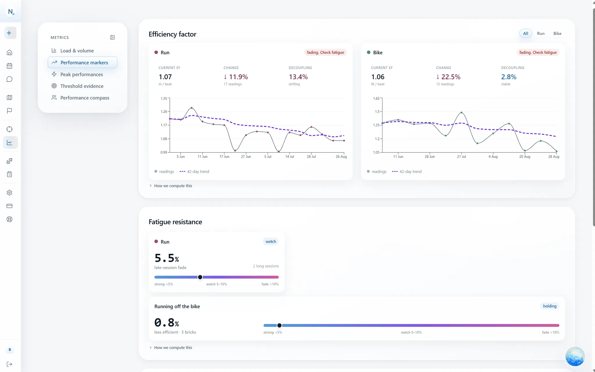
What it shows. Whether your output per heartbeat held together as a session went on. Positive means heart rate drifted upward relative to what you were producing. The convention used here is that 5 percent or less is durable, 5 to 10 percent points at a durability gap, and above 10 percent says the effort was beyond what your aerobic system could hold for that long.
How to read it. As a trend across a block, on the same kind of session. Falling readings across several weeks of comparable long steady work is aerobic durability improving. It is computed only for efforts of at least 45 minutes that were genuinely steady, and it is simply absent otherwise, because decoupling on an interval session measures the workout's structure rather than your cardiac drift.
What it cannot tell you. Whether a change came from fitness. Heat, dehydration, under-fuelling, a bad night's sleep and altitude all push this number up on their own, with your aerobic system entirely unchanged. A single ugly reading on a 30 degree afternoon is a reading about the afternoon. Only comparable conditions make the comparison mean anything, which is why one session never moves the verdict.
Durability
What it shows. What you can still produce late, which is the thing that decides long races and the thing a rested twenty-minute test can never reveal. Three separate reads exist because they need different evidence. Within-session fade compares output per heartbeat in the first quarter of a long steady session against the final quarter, on sessions of 90 minutes or more. On the bike, a work-gated probe sets your best five and twenty minute power after 2,000 kJ of accumulated work beside your fresh bests at the same durations. And late-session bests, taken only from the portion of a session after an hour of prior work, are tracked apart from the fresh curve.
How to read it. The gap is the number, not the late value on its own. Fresh 280 watts against 240 after 2,000 kJ tells you something. The 240 in isolation tells you very little.
What it cannot tell you. Anything at all, if you never train long enough to qualify. An empty durability panel means unmeasured, not durable, and those are opposite things. It also cannot promise the late number will hold on race day under a different fuelling plan, on a different course, in different weather.
Threshold evidence
What it shows. Your strongest candidate efforts of the last year, each plotted as the threshold it implies, next to the setting currently in use. The estimates come from real sustained efforts rather than whole-activity averages or a factor applied to a guess.
How to read it. Look at the spread and the dates, not the newest point. A cluster of recent efforts sitting above your current setting says the setting is stale. One lone spike from a downhill segment is not evidence, and it should not drag your zones with it.
What it cannot tell you. That the number is physiologically true. It is an estimate of what your efforts imply, and it inherits every gap in those efforts. If you have not gone properly hard for twenty minutes since January, the estimate reflects January. This is why a new estimate arrives as a proposal you accept, ignore or explicitly disagree with, and why the underlying efforts stay visible afterwards. A number you know is wrong is a number you can point at, and disagreeing with it is itself useful information.
No single chart is a verdict
Reading them together is the actual skill. Performance is the primary signal. Load, wearable numbers and drift metrics nudge a conclusion, they never decide one alone, and confidence comes from independent signals agreeing rather than from one crossing a line.
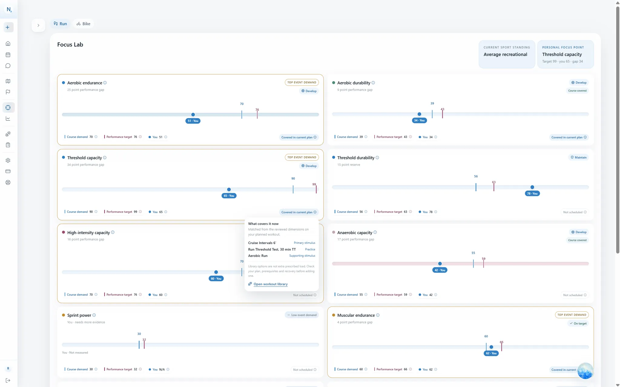
The clearest reason to hold that line is what a single-number readiness score does when you are getting ill. Heart rate is suppressed under deep fatigue, so the morning that most deserves caution can present as unusually good form. A composite score would happily read that as green. Several signals disagreeing with each other is more useful than one confident number, which is also how the gap analysis in the Focus Lab treats your history. The full description of how these markers are computed lives in what the Performance surface measures.
Where a chart points at pain, illness or anything outside training, that is a signal to escalate to a professional. None of this is a diagnosis, and none of it is medical care.